Hi Quilting Friends,
Today on the “Black & White Delight” Quilt-Along – We’re going fabric shopping! Well, not exactly fabric shopping, but I’ll be giving you some tips about fabric selection for your “Black & White Delight” quilt.
Last week I introduced our project, so if you missed it then you can read last week’s “Welcome” post. You’ll find all of the information about our Quilt Along there.
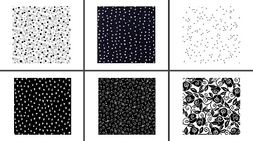
Our Black & White Delight quilt celebrates the stark contrast between black & white. One thing to keep in mind as you choose fabric is that, since we don’t have a variety of hues, tints, or shades involved, you will need to create contrast by varying the pattern and the density of the print in your fabric choices. The images below show the fabrics that I used for my quilt:
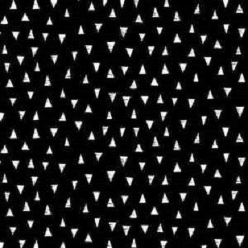
Fabric A, Monochrome Triangles by Blank Quilting 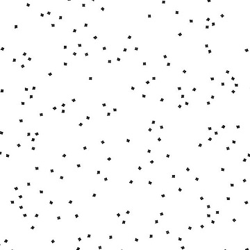
Fabric B, Blossom by Riley Blake Designs 
Fabric C , Monochrome Squares by Blank Quilting 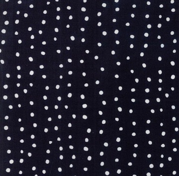
Fabric D , Moda Farm Fresh 
Fabric E , Brooke by Studio 8 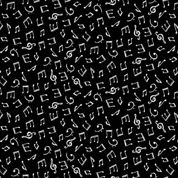
Fabric F, Monochrome Musical Notes by Blank Quilting
I was lucky enough to find most of my fabric at a local quilt shop, which made me confident that the whites and the blacks were going to match across all six of my fabrics because I could put them together and see it for myself. I ended up ordering Fabric B from an online shop because I couldn’t find enough of it locally.
If you don’t have the luxury of a local quilt shop, we’ve found that colors usually coordinate between lines from the same fabric manufacturer as long as the description has the same color name. Unfortunately white isn’t always white and black isn’t always black, so be aware!
If black and white isn’t your style, then use colors that you love instead! The same fabric selection tips will apply, regardless of the colors that you choose. Have a closer look at the blue and white fabrics that Susan used in the “Blue and More Blue” quilt:
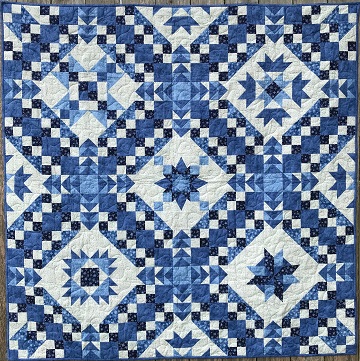
Even though all of the fabrics are just shades of blue and white, there is plenty of contrast due to the shades that Susan used, from very light to very dark. Most of the prints that she used are small-scale, but she’s added a couple of medium-scale prints to keep things interesting. Overall, a monochromatic color scheme can be very appealing.
And the “Pieces of Christmas” quilt:
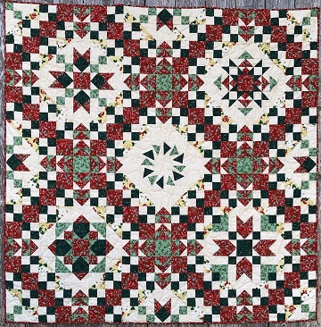
This quilt includes fabrics in two shades of green, one red, and two creamy prints. When you use different colors, the contrast is automatic. You do still want to consider the scale of the prints that you choose, and make sure to include a variety to keep things interesting.
Notice that only one of my fabrics (Fabric A) is directional. Directional prints are a bit more challenging to work with, especially if you’ll be bothered by having the print going in different directions on the finished piece.
I went ahead and used Fabric A anyway, because I love it. I was able keep all of the triangles going the same way on my quilt by careful placement and stitching on the Wild Goose Chase blocks. (Full disclosure- I had to rip out a more than a few rows of stitching to finally get it right, since it would definitely bother me to have my triangles going every which way. I intensely dislike having to un-sew seams, but it was worth it to spend the extra time making sure that I’d be happy with the finished quilt.) My final advice to you on directional prints: Keep them subtle, and avoid choosing stripes or plaids for this project; it probably won’t end well.
It is best to use small-sized to medium-sized prints for this project. I love large-scale prints, but when you’re cutting them up into many smaller pieces, you can end up with some unexpected (and occasionally unfortunate) effects. So I’d advise that you save the large-scale prints for the back of the quilt.
Fabric C , Monochrome Squares by Blank Quilting Fabric D , Moda Farm Fresh 
Fabric E , Brooke by Studio 8 Fabric F, Monochrome Musical Notes by Blank Quilting 
Choose something really boring to use for Fabric B. Well, maybe not exactly “boring” but certainly low-density and random. This fabric will become the background for the rest of your blocks and for the applique borders, so you don’t want to use a print that is SO EXTRA that it demands too much attention. I love this fabric, and I’m so happy that I found it for my quilt!
Speaking of the applique border, here are the jewel-toned fabrics that I used for my applique flowers and leaves which make me think of ruby, garnet, sapphire, topaz, amethyst, peridot, and emerald. I chose a jumbo rickrack that was almost the same shade of green as the “Palm” fabric. Sew beautiful!

Northcott Toscana 9020-281 Roasted Beet 
Northcott Toscana 9020-280 Plumberry 
Northcott Toscana 9020-850 Pansy 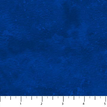
Northcott Toscana 9020-473 Provence 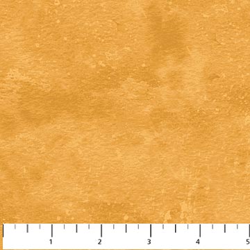
Northcott Toscana 9020-53 Fool’s Gold 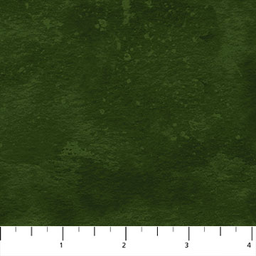
Northcott Toscana 9020-782 Basil 
Northcott Toscana 9020-79 Palm
Choose fabrics in colors that you love for your applique borders! I used blenders, but you could also consider small-scale prints or solids for your flowers and leaves. If your quilt is black and white, then there are no limitations on the combinations that you could use for your borders. You could even stick to black & white flowers; that could be really great! You won’t need the applique fabric for a while, so take your time to make a decision.
Now it’s time to shop! Fabric requirements are listed on the last page of your pattern, or you can use our handy printable file when you go shopping.
Zip over to the local quilt shop, fondle the fabric, and choose your favorite pieces for this project. I really wish that I could go along with you; this is one of my favorite things to do. (Susan would tell you that I’m very good at leading others into temptation at the quilt shop. Maybe it is best if you go with someone else instead. I might get you into Trouble.)
If you’re not lucky enough to have a convenient local quilt shop, do some browsing in your favorite online shops. Get that fabric ordered, and then wait for that cute delivery guy (or gal) to show up at your door. Happiness is . . packages of fabric in the mailbox!
Once you’ve made your selections, snap a photo of those beautiful fabrics and post your picture on Instagram!
#bwqal_yourname @mspdesignsusa
I’ll be back in two weeks, when you’ll “Be a Real Cut-Up!”. Have fun shoppin’!
Happy quilting,
Sharon

One thought on “Fabric Shoppin’ Time”
Comments are closed.